How do I customise the 20i webmail login page?
As part of our White-Label Reseller Hosting you can customise the webmail (Stackmail) login page using HTML and CSS directly via the 20i control panel.
Here are some example CSS below to help you get started!
To add the code:
- Login to My20i.
- Head to Reseller Preferences -> StackCP Theme -> Locate the Webmail Login Page section near the bottom.
- The examples below will need to be entered in to the CSS field.
Note: Ensure you've loaded in the default HTML which is required for the CSS changes to be picked up.
Changing the StackCP Login Logo and Adding Branding
Should you wish to change the branding and logo on your Webmail form, you’ll need to modify the default HTML. On line 58 within the default HTML, you should see the following lines:
<div id="layout-content" class="selected no-navbar" role="main">
<img src="skins/elastic/images/logo.svg?s=1582888499" id="logo" alt="Logo">
<form id="login-form" name="login-form" method="post" class="propform" action="./?_task=login">
This is the HTML that adds the logo and form to the page – to alter the logo, simply change the src part of this line:
<img src="skins/elastic/images/logo.svg?s=1582888499" id="logo" alt="Logo">To the URL of the image you wish to use. For example:
<img src="https://mydomain.com/images/my-logo.svg" id="logo" alt="Logo">Note: The default size for the default webmail logo is 150x150.
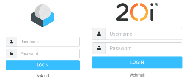
In our example we've replaced the default webmail image with our business logo.

Altering the StackCP Login Form
If we wish to change the look of the form itself, we can use the following CSS:
#login-form {
background-color:#eee;
border-radius:10px;
padding:10px;
max-width: 400px;
}
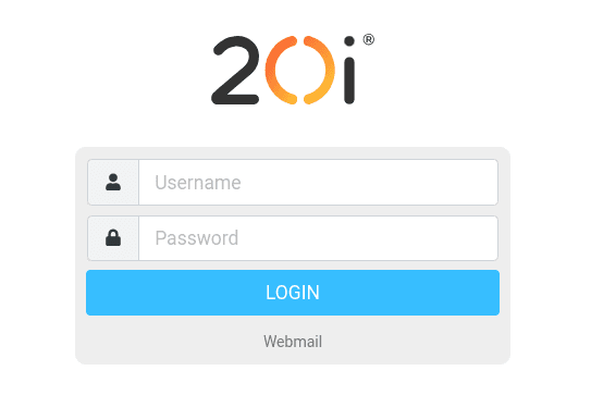
The #login-form section here adds a faint grey background colour to the form, adds some padding to better space the border away from the form entry fields, rounds the corners and increases the size. Modify these values to suit your preferences as needed. As is, this results in the following look:

Updating the StackCP Button and Form colours
Next, let’s modify the login button, and make some changes to the input fields to match the rest of the form. We can do this with the following CSS:
#rcmloginsubmit {
width:150px !important;
border-radius:20px;
background-color:#f7921e;
border:0;
}

#rcmloginsubmit:hover {
background-color:#dd7a08;
}

.form-control:focus {
border-color: #f7921e;
box-shadow: 0 0 0 0.2rem rgb(255,118,0,.25);
}
The #rcmloginsubmit selector handles the login button here – through this, we modify the size of the button, round the corners and change the colour. Update the hex value for the colour and the size values as per your preferences.
The #rcmloginsubmit:hover section handles the colour of the button when your mouse hovers over it – feel free to change the hex value to whichever colour you prefer.
Lastly, the section .form-control:focus controls the colour of the border around the form entry fields when the user has selected it.
This adds a glow that helps users see what section they’re currently inputting data to. Update the hex value to the colour you want for the border, and fill in the rgb values to match the shades you need for your glow colour.
Tools are available online to covert hex codes to RGB values, if required. The ‘.25’ refers to the level of transparency for the highlight (In a range from 0 to 1, in decimals), so if you wish to make this fainter you may wish to reduce it to ‘.1’.
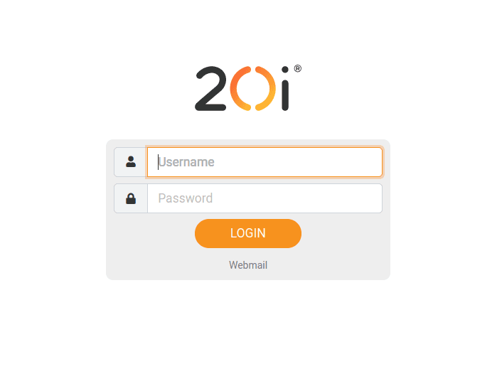
To follow on from our example above, you can see how the above CSS has updated the colours of the 'Login' fields and 'Login' button.

